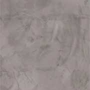
If there’s one thing that separates a convincing faux concrete wall from one that looks… painted, it’s color. Not just what color you choose—but how you build it.
After working through a lot of these finishes, I can tell you this: real concrete is never a single tone. It’s subtle, layered, imperfect—and that’s exactly what you need to recreate.
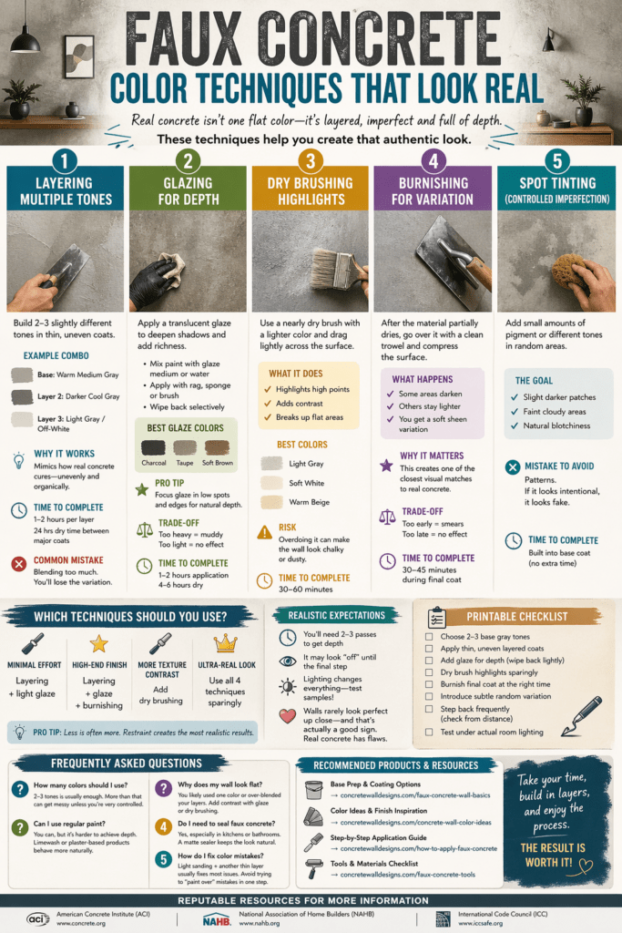
Below is a practical breakdown of the color techniques that actually work, where people go wrong, and how to get a finish that holds up in real lighting (not just in photos).
Why Color Matters More Than Texture
A lot of DIYers focus heavily on texture—trowel marks, plaster thickness, etc. That’s fine, but here’s the truth:
Flat color = fake look (no matter how good your texture is)
Real concrete has:
- Soft tonal shifts
- Slight mottling
- Depth from layers
- Natural inconsistencies
Color is what creates that depth—even on a relatively smooth surface.
1. Layering Multiple Base Tones
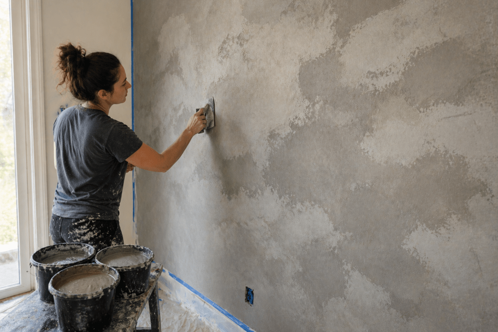
How it works:
Instead of applying one gray, you build 2–3 slightly different tones.
Example combo:
- Base: warm medium gray
- Layer 2: slightly darker cool gray
- Layer 3: very light gray or off-white
Apply them in thin, uneven passes with a trowel or sponge.
Why it works:
It mimics how real concrete cures—unevenly and organically.
Common mistake:
Blending too much. If everything turns into one uniform gray, you’ve erased the effect.
Time to complete:
- 1–2 hours per layer
- 24 hours dry time between major coats
2. Glazing for Depth
How it works:
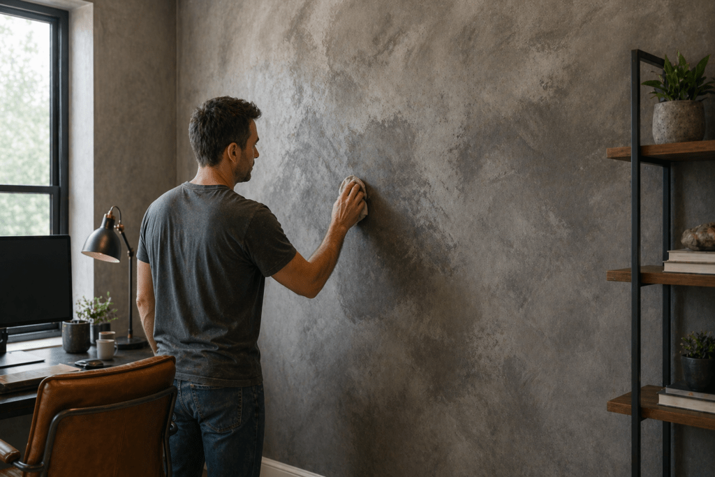
You apply a translucent glaze over your base layers to deepen shadows and add richness.
- Mix paint with glaze medium or water
- Apply with a rag, sponge, or brush
- Wipe back selectively
Best colors for glaze:
- Charcoal
- Taupe
- Soft brown (adds warmth)
Trade-off:
- Too heavy → muddy, dirty look
- Too light → no visible effect
Pro tip:
Focus glaze in low spots and edges—this creates natural depth.
Time to complete:
- 1–2 hours application
- 4–6 hours dry
3. Dry Brushing Highlights
How it works:
Use a nearly dry brush with a lighter color and lightly drag it across the surface.
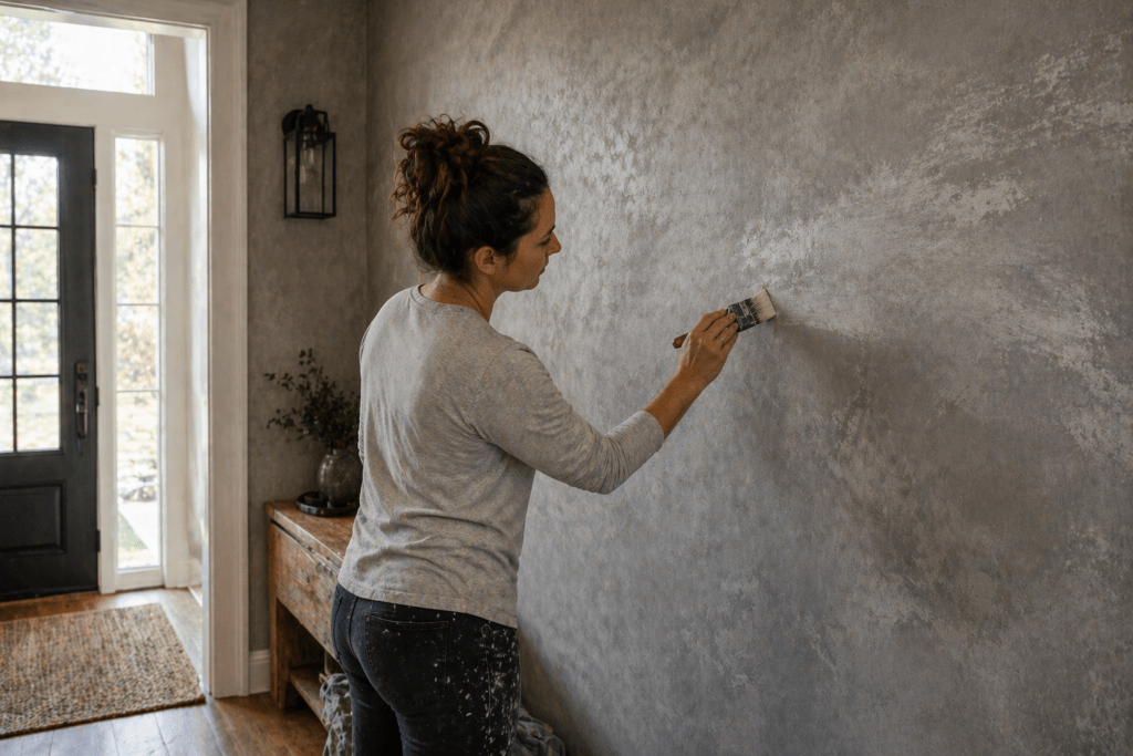
What it does:
- Highlights high points
- Adds contrast
- Breaks up flat areas
Best colors:
- Light gray
- Soft white
- Slightly warm beige
Risk:
Overdoing it makes the wall look chalky or dusty.
Time to complete:
- 30–60 minutes
4. Burnishing for Natural Variation
How it works:
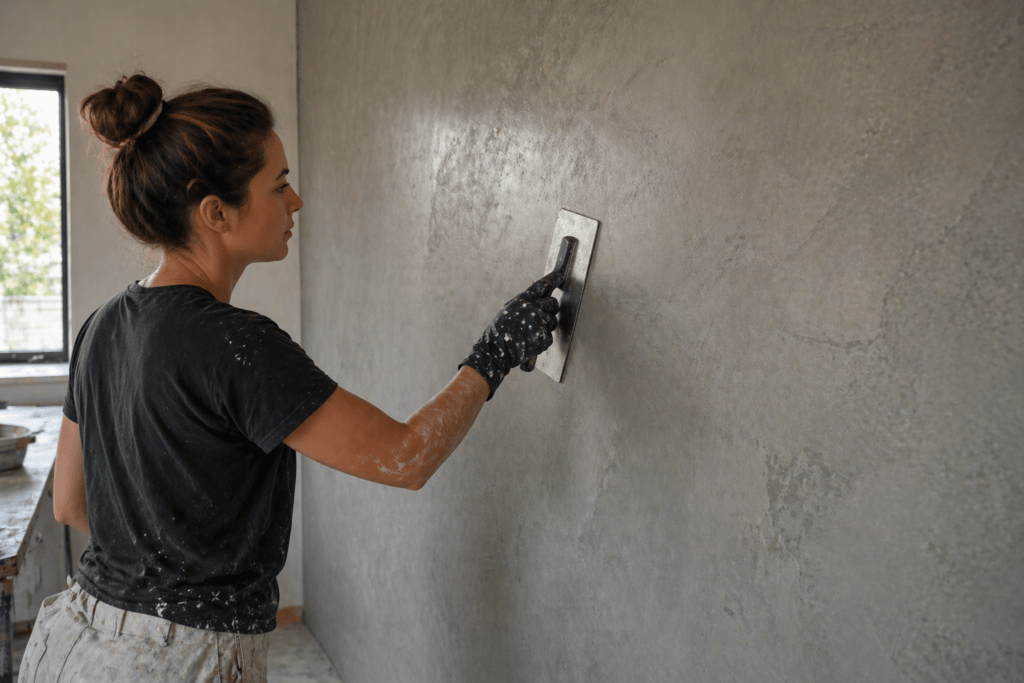
After the material partially dries, you go back over it with a clean trowel and compress the surface.
What happens:
- Some areas darken
- Others stay lighter
- You get a soft sheen variation
Why it matters:
This is one of the closest visual matches to real concrete.
Trade-off:
- Too early → smears
- Too late → no effect
Time to complete:
- 30–45 minutes during final coat
5. Spot Tinting (Controlled Imperfection)
How it works:
Add small amounts of pigment or slightly different tones in random areas during application.
Goal:
Create controlled inconsistency.
Think:
- Slight darker patches
- Faint cloudy areas
- Natural blotchiness
Mistake to avoid:
Patterns. If it looks intentional, it looks fake.
Time to complete:
- Incorporated into base coat (no extra time)
Decision Guide: Which Techniques Should You Use?
If you want:
- Minimal effort: Layering + light glaze
- High-end finish: Layering + glaze + burnishing
- More texture contrast: Add dry brushing
- Ultra-real look: Use all 4 techniques sparingly
Don’t try to max everything out. The best results come from restraint.
Realistic Expectations
Let’s be honest—this isn’t a one-coat project.
What to expect:
- You’ll need at least 2–3 passes to get depth
- It may look “off” until the final step
- Lighting changes everything (test samples!)
Also, walls rarely look perfect up close—and that’s actually a good sign. Real concrete has flaws.
Product Recommendations
For best results, use materials designed for layering and manipulation:
- Achieve optimal results:
→ Expert Tips & Techniques - Step-by-step application techniques:
→ How to Paint a Wall Like Concrete - Tools and materials checklist:
→ Best Tools for Creating Faux Concrete

Printable Checklist
Faux Concrete Color Techniques Checklist
- Choose 2–3 base gray tones
- Apply thin, uneven layered coats
- Add glaze for depth (wipe back lightly)
- Dry brush highlights sparingly
- Burnish final coat at the right time
- Introduce subtle random variation
- Step back frequently (check from distance)
- Test under actual room lighting
Frequently Asked Questions
How many colors should I use for faux concrete?
2–3 tones is usually enough. More than that can get messy unless you’re very controlled.
Can I use regular paint?
You can, but it’s harder to achieve depth. Limewash or plaster-based products behave more naturally.
Why does my wall look flat?
You likely used one color or over-blended your layers. Add contrast with glaze or dry brushing.
Do I need to seal faux concrete?
Yes, especially in kitchens or bathrooms. A matte sealer keeps the look natural.
How do I fix color mistakes?
Light sanding + another thin layer usually fixes most issues. Avoid trying to “paint over” mistakes in one step.
More Resources
- American Concrete Institute (ACI): https://www.concrete.org
- National Association of Home Builders (NAHB): https://www.nahb.org
- International Code Council (ICC): https://www.iccsafe.org
Conclusion
If you focus on one thing, make it this: variation beats perfection.
The best faux concrete finishes don’t try to look flawless—they lean into subtle inconsistency. Build color slowly, layer with intention, and stop before you overwork it.
That’s the difference between a wall that looks painted… and one that makes people stop and ask if it’s real.